Comparing PCA and t-SNE
Intro
Dimensionality reduction is one of my favorite topics in data science.
Predicting stuff is fun, but taking a dataset with 8,000 columns you know little about, performing some math on it, and visualizing it to getting some information out of it is extremely satisfying.
That’s why today’s project is going to be on-
Dimensionality Reduction 🎉
In particular, we will be reducing and visualizing microarray data and trying to gain a little intuition about these techniques.
In particular this dataset has 4 different categories-
- Calibrator’s (control Blood samples)
- QC samples (also control blood samples, just different from the calibrators)
- Buffer samples (negative controls, basically water)
- Patient samples (Blood samples drawn from people)
The dataset also has 7.4k features.
Each of the below topics can be and often are the topic of whole courses in advanced mathematics, so we will definitely keep it high level.
Dimensionality Reduction
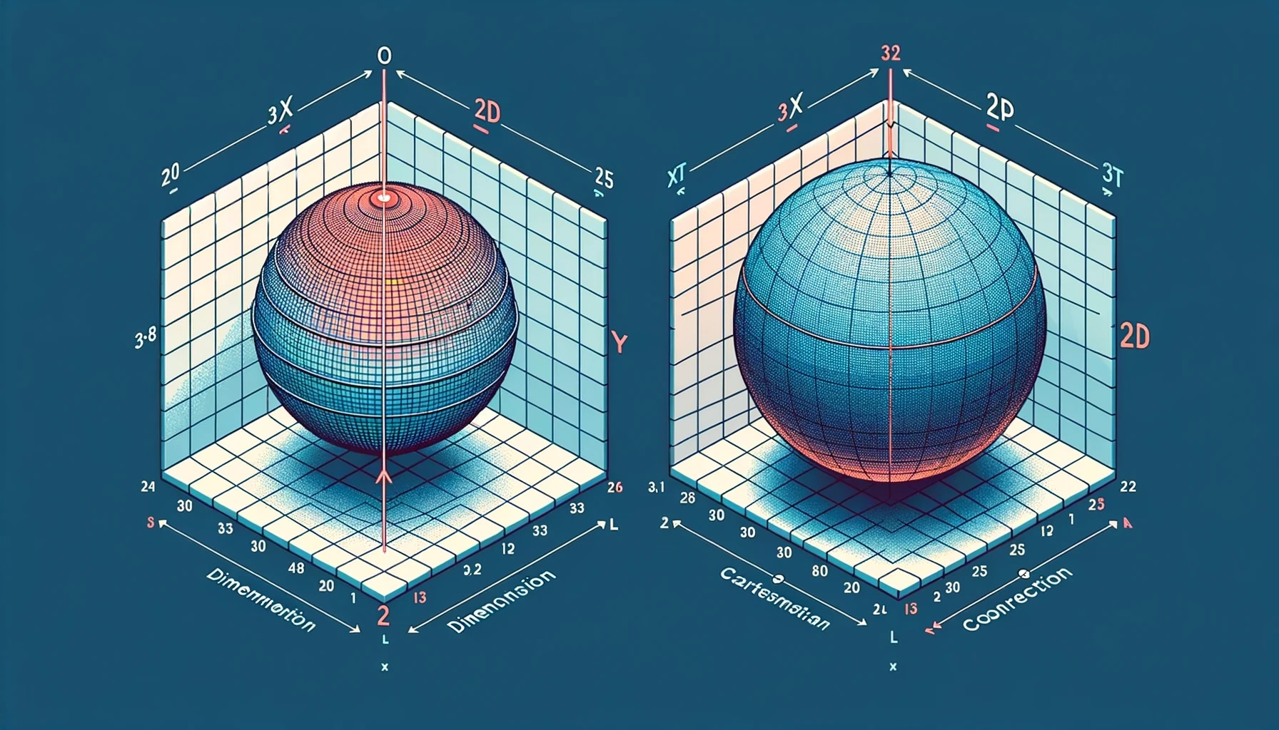
We’ll start with 2 non-trivial questions-
What does it mean to reduce dimensions?
and
Why should we do it?
Reducing the dimensionality, or narrowing down the feature space of our dataset, means we are applying mathematical techniques to transform and represent our data in a space with fewer dimensions.
There are many reasons why we may want to reduce the feature space of our data, but we will only touch on one.
- To better visualize our data.
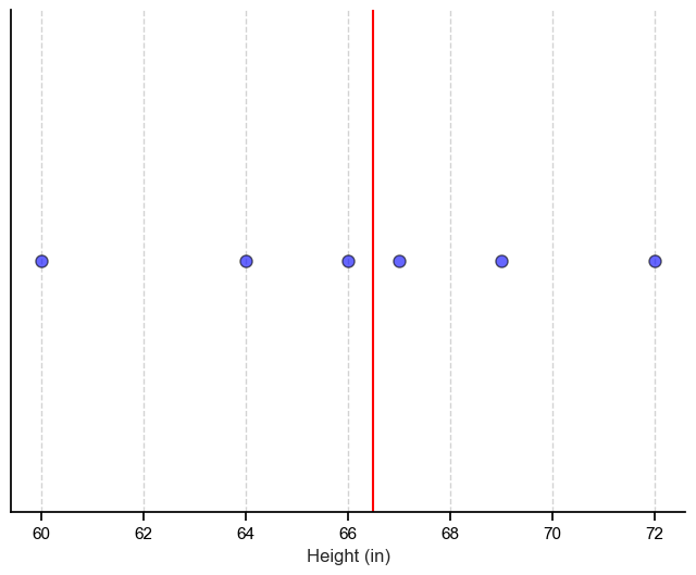
To give an example let’s imagine we have a dataset with one column (also called a feature), and that column contains the height of 6 people.
| Name | Height (in) |
|---|---|
| Joe | 69 |
| Bob | 67 |
| Anne | 66 |
| Mary | 60 |
| Tom | 72 |
| Jane | 64 |
Since there is only one feature, we can easily visualize our dataset on a number line and get meaningful information from it such as the median, indicated by the red line. We can also think of our dataset as being 1-dimensional.
What if we added a second feature, for example weight?
| Name | Height (in) | Weight (lbs) |
|---|---|---|
| Joe | 69 | 200 |
| Bob | 67 | 185 |
| Anne | 66 | 166 |
| Mary | 60 | 131 |
| Tom | 72 | 237 |
| Jane | 64 | 155 |
Well, we still can comfortably visualize our entire dataset and get even more information from it. In particular, that there seems to be a linear relationship between height and weight. We also increased the dimension of our data by 1, so we now have a 2-dimenionsal dataset.
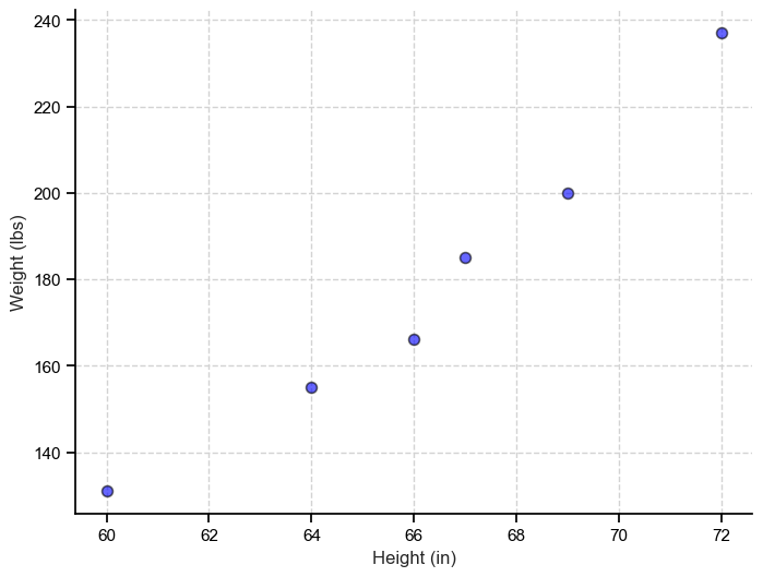
But what if we had 10,000 features? To visualize our entire dataset we would need a plot with 10,000 axes, which we cannot do in the 3-D world we operate in. That’s where dimensionality reduction comes in.
Note: It’s important to keep in mind that while I will try to keep verbiage to a minimum and my descriptions clear not everything will immediately make sense, and that’s ok.
Let’s dive into the 2 techniques.
Principal Component Analysis (PCA)
When we reduce our dataset using PCA we are essentially looking at the direction of our data and capturing the directions with the most variance into what are called principal components.
PCA identifies linear relationships as well as the global structure.
And we can plot the first two principal components to get an idea of the structure of our data.
# PCA
scaled_data = StandardScaler().fit_transform(df.iloc[:, 1:-1]) # First row is categorical data
pca = PCA(n_components=10)
pca_data = pca.fit_transform(scaled_data)

cols = ['Component_' + str(x) for x in range(1, 11)]
pca_df = pd.DataFrame(pca_data, columns=cols)

sns.scatterplot(data=pca_df,
                x='Component_1',
                y='Component_2',
                s=30,
                alpha=0.45,
                edgecolor='black',
                hue='SampleType',
                linewidth=0.5)
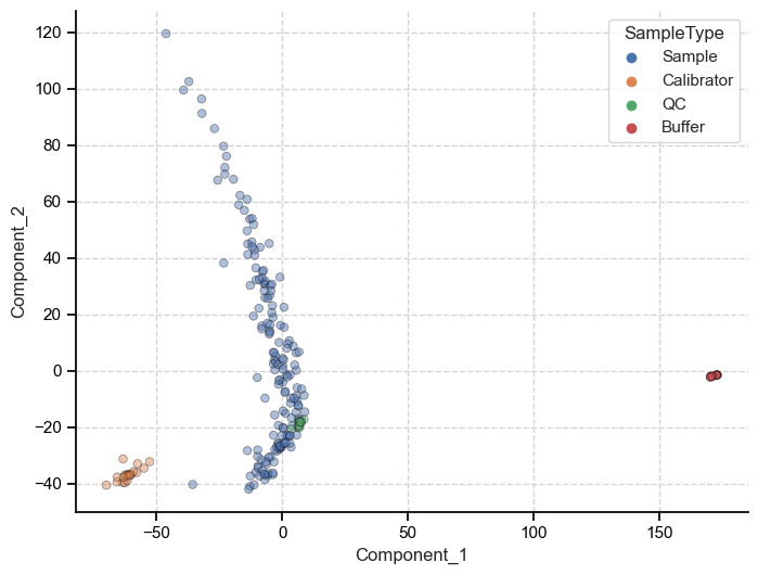
Because PCA preserves the global structure of the data we can make inferences about the data based on the relative distance between individuals points. Meaning, we can say that because the patient samples are closer to calibrators when measured on principal component one (x-axis), they are more similar to each other than to the buffer samples.
t-Distributed Stochastic Neighbor Embedding (t-SNE)
When we reduce our dataset using t-SNE we are doing a couple things differently.
-
t-SNE is non-linear. Meaning it can capture relationships in the dataset that are not linear.
-
t-SNE aims to preserve the local structure in the dataset (as opposed to the global structure)
These two differences come with some advantages and disadvantages. Namely, we can better visualize local relationships and identify disparate cluster’s but we lose the broad and overarching patterns within the dataset.
# tSNE
tsne = TSNE(n_components=2, perplexity=15, random_state=42)

X_tsne = tsne.fit_transform(scaled_data)

tsne_df = pd.DataFrame(X_tsne, columns=cols[:2])

sns.scatterplot(data=tsne_df,
                x='Component_1',
                y='Component_2',
                s=30,
                hue='SampleType',
                alpha=0.6,
                edgecolor='black',
                linewidth=0.5)
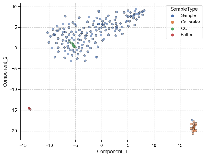
We can see that t-SNE also picked up on the three separate clusters and their local relationship (how close each point is to other points within its cluster), but these clusters are more or less equidistant from each other.
Now, each technique has a myriad of other applications that one would need to consider when deciding which to use but in general-
If you want to get idea of the global structure of your data you should use PCA.
If you have more complex, non-linear patterns and want to retain the local structure of you data, use t-SNE.
Outro
I tried my best to keep this one brief yet informative. This topic is extremely tough to boil down into a couple of bullet points, but I tried my best. I very likely will do a follow-up going into each one in more detail. Stay tuned!
You can find the code for this in my Github repo here and you can find the microarray data here.
Project 2 ✅
