Determining Batch Effects
Intro
Much of the work I’ve done in data science and bioinformatics involves playing detective with data. Why are these datasets different? What is causing the excess variance we are seeing? These are just a few of the questions that arise when you have sensitive sequencing machines, large amounts of data, and very powerful machine learning algorithms. That sensitivity is both a blessing and a curse. On the one hand, we can find the tiniest molecular differences between disease states. On the other hand, one batch of samples left on the bench for too long or one uncovered sneeze, and your experiment is nearly ruined. It’s like that one lab every biology major has done where you culture your hand and see the colonies of bacteria you’ve picked up over the course of the day. Yes, we know the bacteria is there, but we don’t want to see it.
In all reality, it doesn’t matter if we transfer our samples by sucking them up and spitting them out with a straw or if we use a state-of-the-art Hamilton liquid handler. There will always be variance introduced during processing, and in a way, we can take some solace in that. The lab temperature, humidity, and elevation will all contribute some technical variance, and if you get enough data, you certainly will find it. When the sum of technical variance exceeds the biological variance, or your treatment is correlated with your batch effect, that is when we have a problem.
Part of the reason batch effects are so nefarious is because they aren’t found until it’s too late. It’s very likely the principal investigator has already “done” the study, so to speak. If they’ve recruited human subjects, they have already treated them with their drug of interest and taken the pre- and post-treatment samples. If they’re working with mice, they’ve likely already sacrificed them, sent their samples to a company for sequencing, begun their QC on the data, and found that big, ugly batch covariate. Hopefully, the PI still has some samples they can process and sequence, but at minimum, they have lost time, and the conference they want to present at isn’t going to be rescheduled.
Trust me when I say that I have been in my fair share of meetings filled with awkward silences, having to break the news to an upset investigator. The moment when the realization sets in that the unexpected cluster of samples in the top right corner of their PCA biplot all just happened to be processed by the graduate assistant they probably should have had pipette water for a couple more hours is never a good feeling. I hope you don’t read this as a smug “gotcha, your samples suck!” type of post. These moments are always a huge bummer for everyone involved. That’s why I hope sharing some of the skills I’ve picked up to catch these problems fast and early will help minimize time wasted and ensure more awesome research gets published. 🤙🏽
Also, I’m going to plug a quick disclaimer here. I am NOT a statistician. I have the formal training equivalent to probably (pun intended?) 2 statistics courses at your local community college, and this is not a peer reviewed research article. This article was peer reviewed by my cat Vader, so do with that what you will.

Begin with the end in mind
The best offense is a great defense, and by defense, I mean a great study design. A well-crafted study design will ensure that technical variation is minimized while biological variation between treatment groups is maximized. All good studies usually have a couple of things in common:
-
A solid sample size: I know samples are precious and expensive, but the more samples you can commit to your study, the more likely you are to observe a difference between your treatment groups. While it certainly depends on the assay you’re going to run, you can conduct a power analysis that can give you a ballpark idea of the number of samples you should commit. However, in general, the more, the better. Even if you had unlimited samples, the cost of sequencing them is still a factor to consider. That’s why another important aspect of your study design is the treatment groups.
-
Well-designed treatment groups: Paired groups beat unpaired groups, and fewer groups beat more groups, at least in terms of the power of the statistical tests at your disposal. Of course, you still need to answer your biological question of interest. If you are looking to test two different drugs on gene expression, then you’re likely going to need three separate groups: a control group, a group treated with drug A, and a group treated with drug B.
-
Technical replicates: Some assays include technical replicates as part of the assay they run and can provide them in your data deliverable, which is fantastic. This means you don’t have to include technical replicates in your samples. However, if the assay does not include technical replicates, it might be a good idea to keep a batch of samples that you can send in triplicate with every set of samples you submit for sequencing. This can be useful for batch effect correction should a batch effect become present.
-
Follow the company’s sample preparation protocol: Companies know their platform. They know the RNA yield they need for great sequencing results. The lab knows what sample preparation procedure will produce great results and which will not. Even if you don’t fully agree, I would advise following their procedures when processing your samples. At a minimum, if the data do not come back looking good, you can blame the company and at least get a refund or rerun.
-
Randomly process and send your samples: The worst kind of batch effect is the kind that is correlated with the treatment of interest. If your data are clustering on a PCA biplot by treatment, but you also processed all of the control samples on Monday and all of the treatment samples on Friday the following week, how do you know that the variation you are seeing is due to your treatment or a batch effect? Furthermore, if you correct for it, how do you know if you are correcting the batch effect or blunting your biological response? When you send your samples for sequencing, if you are sending more than what can be placed on one 96-well plate, randomize them. Don’t send all your controls on one plate and the treatment samples on another.
Well, if we assume we had a great study design and we get back our data, how can we ensure a robust dataset? Let’s walk through the approach I take to determine the quality of the data we get back.
Is there a batch covariate?
There are three main questions I aim to answer when beginning an investigation:
- Is there a batch covariate?
- If there is a batch covariate, how large is it?
- If it’s too large (as determined by some empirical standard), how can we correct for it?
Let’s tackle these one at a time.
In my opinion, you have to adopt the mindset of looking for a diamond in a pile of dirt (or perhaps a lump of coal in a pile of dirt?). Your dataset contains information that will shed light on its quality, regardless of the type of data you’re analyzing. Most people want a variable or metric that indicates whether their dataset is good or bad, and I don’t necessarily think this is a bad thing. However, relying solely on such metrics can become a crutch. Your dataset, with all its variables, has a “shape” in a real sense. That “shape” is what we can “model.” A QC variable or metric is fine to look at, but you should be confident that, given a blank matrix of 12 rows and 25,000 columns, you’ll be able to extract some information from it. For the example walkthrough, I will be using a bulk RNAseq dataset from the Gene Expression Omnibus (GEO). I duplicated the dataset, added some noise, and then concatenated them together, resulting in 32 samples in “duplicate” and 2 “batches.”
Principal Components Analysis
Let’s assume we’ve been tasked with answering question 1 from a scientist in our lab, our PI, the president, or whoever. I always begin with the raw, unnormalized count matrix and dimensionality reduction techniques. I start with the raw count matrix because that is often what researchers start with. The number of times I’ve heard a researcher state that they just want the raw data with no normalization applied is fairly high, so it’s often a good bet that is what they analyzed and where they found this “batch effect.” I begin with dimensionality reduction because it gives me an idea of the “global” variance in a dataset. Normally, this technique is Principal Component Analysis (PCA) because it preserves the relationships between clusters, unlike t-SNE.
If you need a review of dimensionality reduction techniques—one of the coolest matrix transformations you can do—go here.
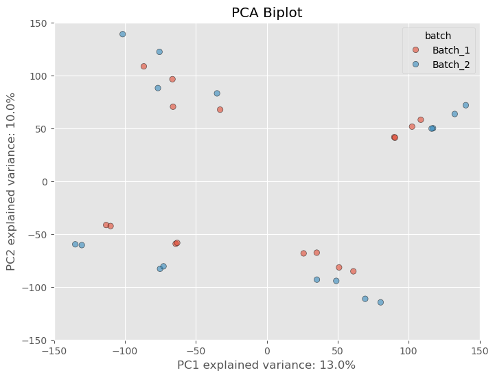
Raw, unnormalized matrices have a lot of variability because there are many lowly expressed genes that have not been filtered out. When you have genes with low values, a change of 5-10 counts is going to affect the dataset more than a difference of 5-10 counts in a gene that has an average of 1000 counts. However, if the first two principal components do not show any separation based on a batch variable but are clustering based on treatment, it is likely that the technical variance due to the batch is not strongly influencing the data. This would lead me to believe that the data are fine. If we look at the PCA biplot with our batch-affected dataset, we see that there is a clear difference between the duplicate samples.
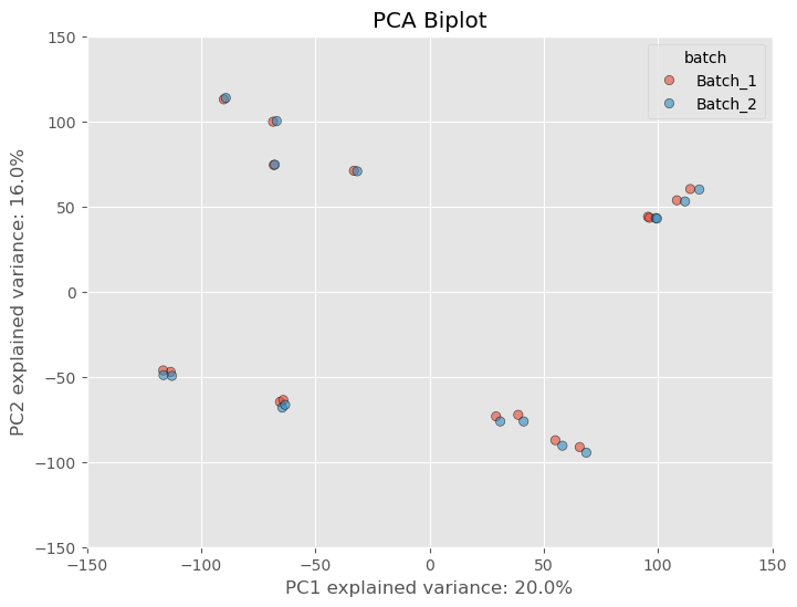
However, as is common practice amongst researchers we often want to filter out these lowly expressed genes based on some criteria. What criteria is appropriate is a question that I think might be outside of the scope of this article, but what I can say is that some standard filtering process is essential. I usually opt to filtering out genes that have at least 10 counts across all samples. There probably is a better way, but I usually opt for this way because it’s quick and dirty and it’ll get the job done. If we apply the filterting to our dataset we see the separation based on the batch variable lessen substantially.
That’s only from one step of normalizing the data. Most software packages (if not all) like edgeR and DESeq2 perform further normalization as well which will further mitigate any variance from a batch effect. These packages often take in raw counts matrices but the normalization is done “under the hood”, or without you actually have to perform the arithmetic yourself. If we normalize our dataset further using a common normalization scheme called “size factor” or “median” normalization- we see not only batch effect decreases but the variance between samples and clusters of samples decrease.
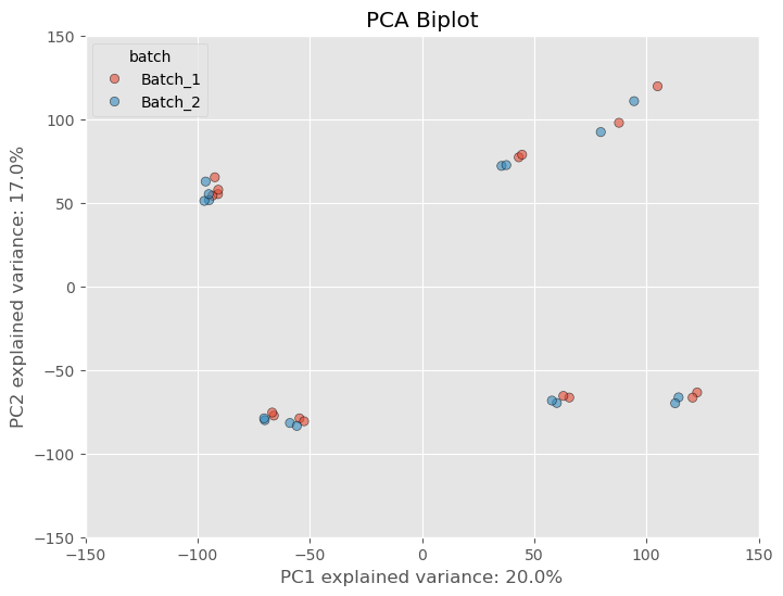
Now, did the seperation between batches, go away? No, it’s still noticeable, but DESeq2 and Generalized Linear Models are fairly robust to these types of differences and can control for them by adding a batch covariate into the model design. This covariate accounts for the technical variability introduced by the batch effect and reduces the impact on the results. To add some more confidence to our dataset, because we used PCA to reduce our dataset to principal components, the global structure of our dataset is preserved and we can make inferences based on the relative distance between individuals points. In other words, because the batch affected samples are closer to the other replicates than they are to samples of different treatment conditions, we can assume the technical variance is not confounding the dataset too much.
Concordance Plots
Some researchers aren’t extremely comfortable with PCA plots and that’s completely ok. There are other ways we can visualize the variance within a dataset. Another way is by calculating Lin’s Concordance Correlation Coefficient (CCC) as well as Pearson’s Correlation Coefficient (r) and plotting the agreement between replicate samples using concordance plots. While I do think it’s beneficial to still calculate Pearson r between replicates I always opt for Lin’s CCC as my measure of agreement. Two samples could be perfectly correlated even if the values for each gene in sample 2 are all increased by 900+ counts. This would still be an egregious batch effect which Pearson r would miss but Lins CCC would reflect.
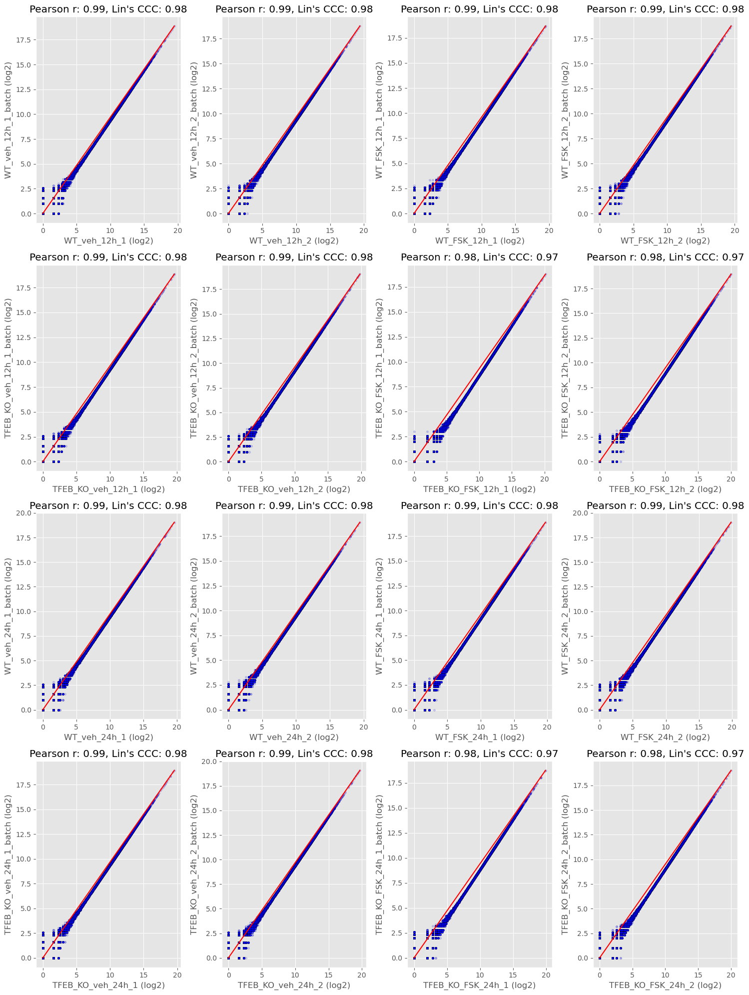
The middle red line is the line of identity and each data point is a gene. Each replicate sample is from a batch. Ideally, if you are measuring the same thing (sample1 vs sample2) they should have the same value for each gene. Two samples that are in perfect agreement would fall perfectly on the red line and have a Lins CCC and Pearson r of 1.0. We could do things like report the median value for lin’s CCC to get an idea of the concordance between batches or we could note any pairs that may be problematic.
Distribution plots
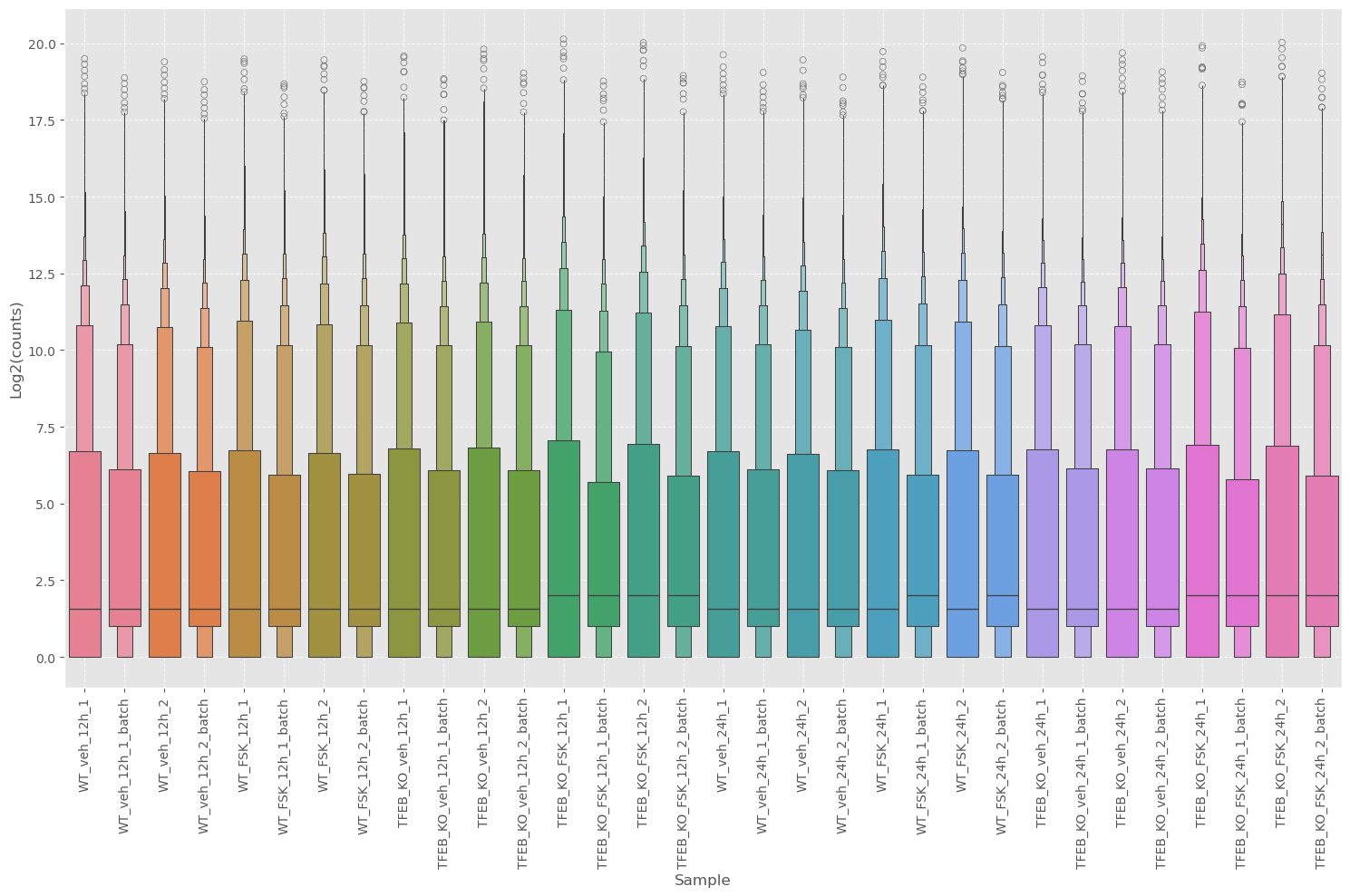
While the concordance plot can tell us the agreement between genes, it’s difficult to get an idea of the central tendency or distribution. We can use boxplots to get this information.
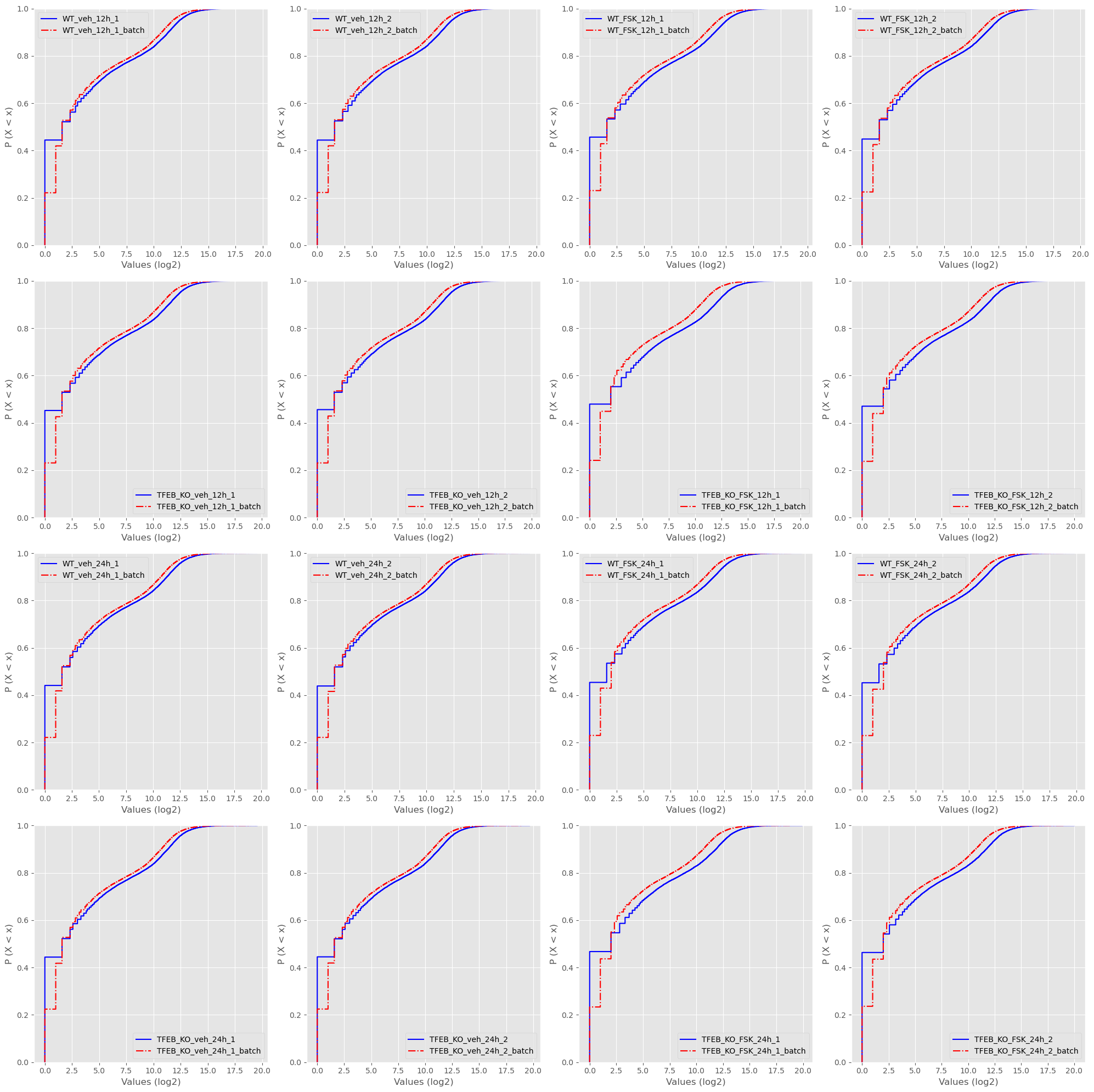
Along with ECDF plots.
And PDF plots.
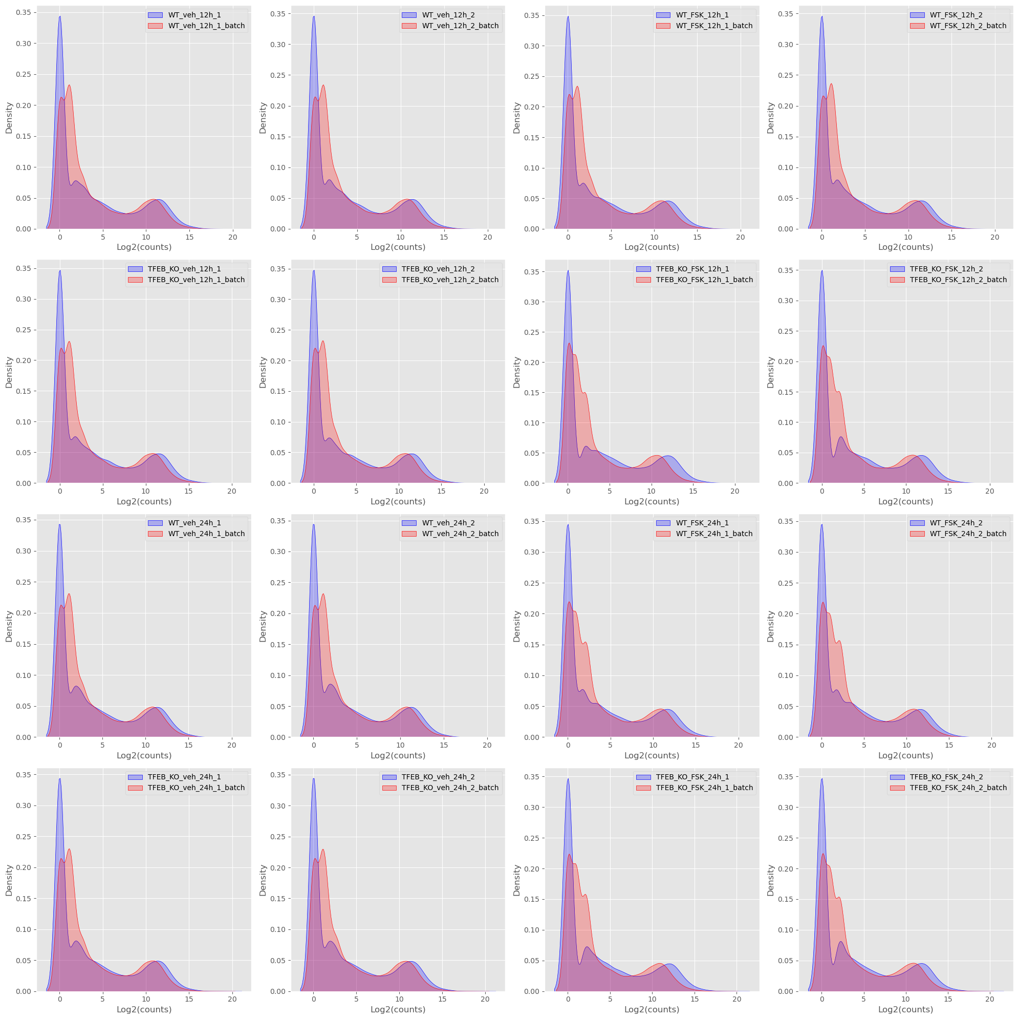
As I’m sure you can tell my commentary gets less and less because I essentially look for the same thing in each of the plots and that is are replicate samples between batches are the same. Do they look the same? Are the medians lining up? Is there a drastic change in distribution? None of these plots are evidence in the strict sense, but they do give an intuition as to if there is a problem or not.
Conclusion
I know some of my colleagues with a more critical eye might say my approach is a little hand wavy, and it is! Would this be good enough for a late stage clinical drug evaluation with millions of dollars on the line? No, probably not. But 1. if a company is seeing something like this at that stage they probably have bigger issues and 2. most of the researchers I work with aren’t working with a study of that kind of scale. That doesn’t mean that they shouldn’t get fantastic treatment, but one has to weigh the speed at which results are delivered with the confidence you are giving to the researcher that their study will still yield good results. As I said in the beginning all studies have technical variation or “batch effects” and that’s ok.
In all honesty I was not expecting this article to be this long and to only have gotten about half way! We still haven’t gotten into estimating batch effect size or removing batch effects from datasets, but that is up next!
Also, I would highly suggest becoming more familiar on normalization techniques that are employed for various types of technologies (DESeq2, edgeR, etc). Understanding why they are transforming the data and how they are doing it will be immensely helpful in understanding how technical artifacts are accounted for, and you can start implementing it yourself!